A Symphony of Paper: The Aesthetic Principles Underlying First Day Cover Design
For the serious philatelist, the First Day Cover (FDC) is more than just a cancelled stamp; it's a miniature work of art, a snapshot of a moment in postal history, and a testament to the enduring appeal of beautifully orchestrated design. Often overlooked by casual stamp collectors, the true beauty of an FDC lies in the delicate balance of its components - the stamp itself, the postmark, the cachet (the decorative design printed on the cover), and the journey it took. While rarity and condition undeniably influence value, the intrinsic aesthetic appeal, the “symphony of paper” as I like to call it, elevates an FDC from a mere collectible to an object of genuine artistic merit. My grandfather, a meticulous engineer and an even more meticulous collector of antique accordions, taught me to appreciate the elegance of design – how simple principles, applied with precision and passion, could create profound beauty. He’s the one who first showed me an early FDC, a Scott #C1 from 1950, and how the simplicity of the cover’s design, alongside the clear, almost musical clarity of the postmark, spoke volumes.
The Dance of Typography: Voice and Visual Hierarchy
Typography, in the context of FDC design, isn't just about legibility – it’s about conveying a specific tone and establishing visual hierarchy. Consider the difference between a bold, sans-serif typeface used for a commemorative issue celebrating a national monument versus a delicate, script font used for a stamp honoring a poet. The choice of font immediately sets the mood, conveying a sense of grandeur, solemnity, or celebration. Early FDCs often employed a more formal, traditional typography, reflecting the era’s design sensibilities. Later designs, particularly those from the 1970s and beyond, experimented with more modern and playful fonts, reflecting the changing artistic landscape. The placement of type is equally crucial. The date of the first day of issue is often prominently displayed, acting as an anchor for the design, while descriptive text is carefully positioned to complement the imagery. The best cachets understand how typography can direct the viewer's eye, creating a visual journey across the cover.
Layout and Composition: The Art of Balance
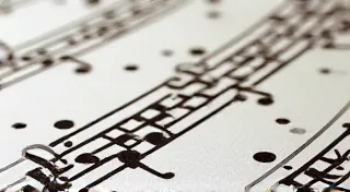
The layout of an FDC is more than just where to put the stamp and the text; it's about creating a sense of visual harmony. Early FDCs often adhered to a more symmetrical design, with the stamp centered and the postmark positioned neatly below. As design aesthetics evolved, asymmetrical layouts became more common, adding a dynamic and modern feel. The use of negative space, the empty areas surrounding the elements, plays a vital role in creating a balanced and uncluttered design. An overcrowded cover feels chaotic and diminishes the impact of the individual components. The best FDCs understand how to use space to draw the eye and create a feeling of elegance and sophistication. Think of it like composing a piece of music – the silence between the notes is just as important as the notes themselves.
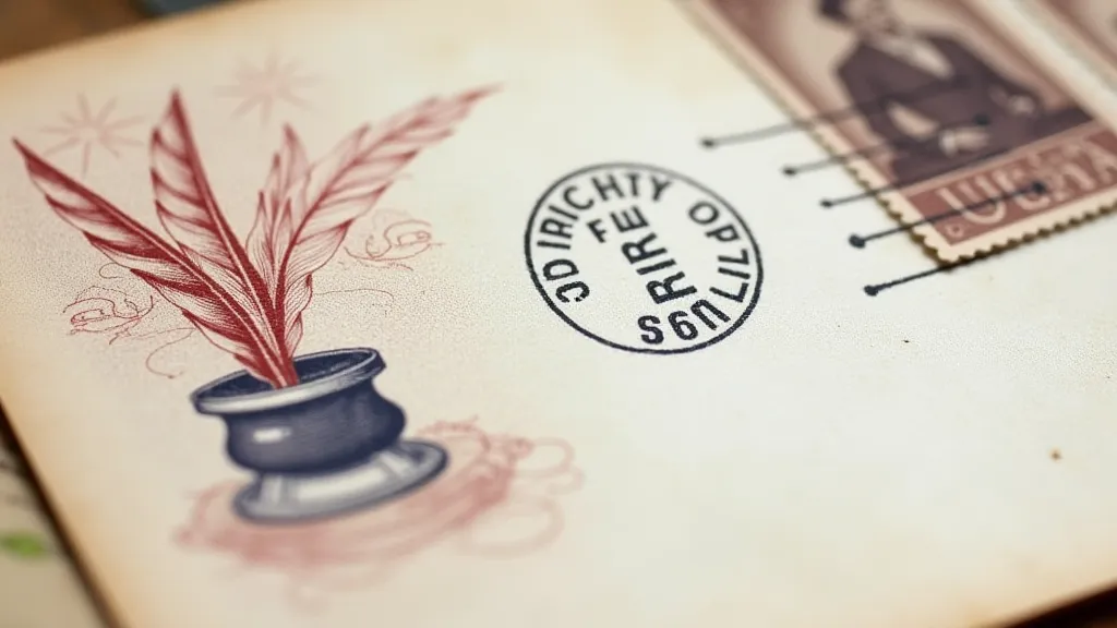
Imagery: Storytelling Through Visuals
The imagery on an FDC serves as a visual narrative, expanding on the theme of the stamp and adding another layer of meaning. Early cachets often featured straightforward depictions of the subject matter – portraits of historical figures, views of iconic landmarks, or illustrations of important events. As artistic trends evolved, imagery became more abstract, symbolic, and experimental. The use of color is also crucial. Early FDCs often employed a limited palette of colors, reflecting the printing techniques of the time. Later designs embraced a wider range of colors, creating a more vibrant and eye-catching appearance. The artistry of the cachet designer isn’s just about technical skill; it's about capturing the essence of the subject matter and translating it into a compelling visual representation. It’s a challenge to convey a complex idea in a small space – that’s what separates the good from the exceptional.
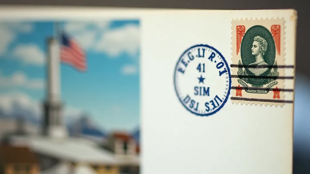
Postmarks: Echoes of History
While often overlooked, the postmark on an FDC is an integral part of its aesthetic appeal and historical significance. It's a tangible record of the stamp's journey through the postal system, a silent witness to its passage through time. The clarity and quality of the postmark are crucial. A crisp, well-inked postmark is visually appealing and adds to the overall impression of the cover. Variations in postmark design, such as hand-struck markings or unusual cancellations, can add to the cover's value and collectibility. The location of the postmark can also be significant, particularly for collectors interested in regional postal history. Early postmarks, often executed with a beautifully crafted hand-carved die, were works of art in themselves. They represent the personalized service that characterized the postal system in a bygone era.
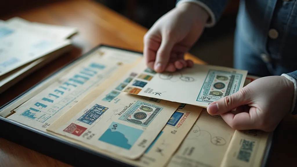
Restoration and Preservation: Honoring the Past
Preserving the aesthetic beauty of an FDC requires careful handling and a commitment to responsible restoration techniques. Exposure to light, moisture, and pollutants can degrade the paper and fade the colors, diminishing the cover's visual appeal. Gentle cleaning with archival-quality materials can remove surface dirt and grime, restoring the cover's original brightness. Minor tears and creases can sometimes be repaired with acid-free tape, but excessive restoration work can detract from the cover's value and authenticity. Understanding the limitations of restoration is key – the goal is to preserve the cover’s integrity, not to create a flawless replica. Like the delicate reeds of my grandfather’s antique accordion, FDCs are susceptible to damage from careless handling. Respect for their fragility is paramount.
Appreciating the Symphony
Collecting First Day Covers isn’t merely about acquiring rare pieces of paper; it's about connecting with history, appreciating artistry, and celebrating the enduring power of design. The aesthetic principles underlying FDC design, from the careful selection of typography to the thoughtful arrangement of imagery, are a testament to the creativity and craftsmanship of generations of postal officials and cachet designers. Next time you examine an FDC, take a moment to appreciate the symphony of paper before you – the delicate balance of form and function, the echoes of history, and the enduring beauty of a miniature work of art.