Unveiling the Anomaly: Investigating the Most Notable First Day Cover Errors & Oddities
For those of us captivated by the meticulous world of First Day Covers (FDCs), it’s easy to become enamored with the order, the precision, the inherent history encapsulated within a single, carefully prepared envelope. We appreciate the elegant typography, the vibrant cancellations, the tangible connection to a specific moment in time. But occasionally, the system falters. Imperfections arise. And it’s in these anomalies – the printing blunders and unique oddities – that a new layer of fascination, and often, substantial value, emerges. They are the echoes of human error, the whispers of a bygone era, and, in a strange way, even more precious than their pristine counterparts.
I recall, as a young boy, sifting through a box of my grandfather's FDCs. He was a quiet, methodical man, a retired postman with an almost reverential respect for the postal service. He’s the one who introduced me to this captivating hobby. Amongst the mostly flawless examples, a single envelope stood out. The cancellation was crooked, the date smudged, and the overall appearance… chaotic. I questioned its place among his treasures. He simply smiled and said, "Sometimes, the stories are best told by the imperfections, son. They show you the hand that guided them." That lesson has stayed with me, fueling my pursuit of these exceptional errors.
These errors often arise from the sheer scale of production. Imagine the pressure on postal workers, printers, and designers striving for perfection while handling millions of envelopes. It's a process far more complex than one might initially assume, a fascinating interplay of art and engineering – a concept explored in greater detail in articles like "Chronicles of Paper & Ink: Unveiling the Soul of a First Day Cover".
The Allure of the Mistake: Why Errors Matter
The value of an FDC is typically driven by factors like the stamp’s rarity, the quality of the cover, and the cancellation’s uniqueness. Errors disrupt these norms. They’re a direct consequence of the massive scale of FDC production – imagine the pressure on postal workers, printers, and designers striving for perfection while handling millions of envelopes!
Think of it like this: many antiques hold a certain value, but it's the unique characteristics – a maker's mark, a subtle crack in the varnish – that elevate them. The same holds true for FDCs. A printing error, a misplaced cancellation, a franking irregularity – these aren't liabilities; they’re evidence of a human process, a tangible link to the labor and challenges faced in delivering the mail. They offer a glimpse behind the curtain, revealing the complexities of a seemingly simple transaction. The nuances in color and design, often representing artistic choices, can also contribute to a cover's story—a subject explored in "Chromatic Reveries: The Art & Science of First Day Cover Color Variations".
Notable Errors & Oddities: A Collector’s Guide
Let’s delve into some of the most sought-after and fascinating errors found on FDCs. It’s crucial to understand that "rarity" and "value" are subjective and fluctuate based on collector demand.
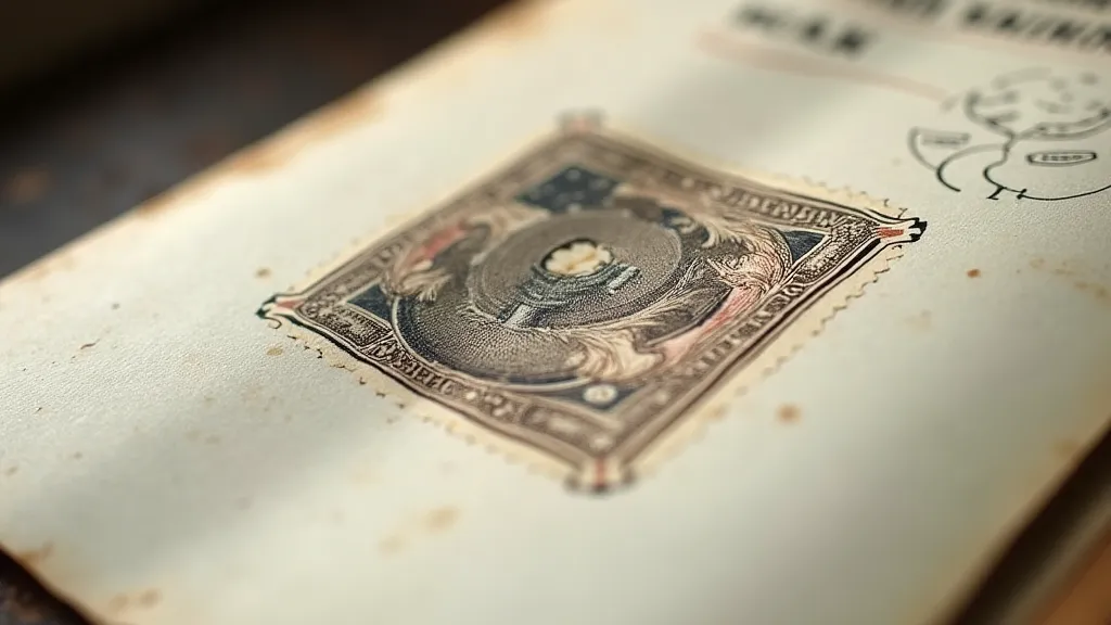
The 1957 Sesquicentennial Issue – The “Second Die” Cancellation
The 1957 Sesquicentennial issue, commemorating the 150th anniversary of the US Post Office, is renowned for its "Second Die" cancellation errors. This occurred when the date punch was accidentally struck twice, creating a double-impression of the date. The double impression isn't always obvious, but a trained eye can discern the subtle doubling. Covers with this error are significantly more valuable than standard examples, especially if the doubling is clear and distinct.
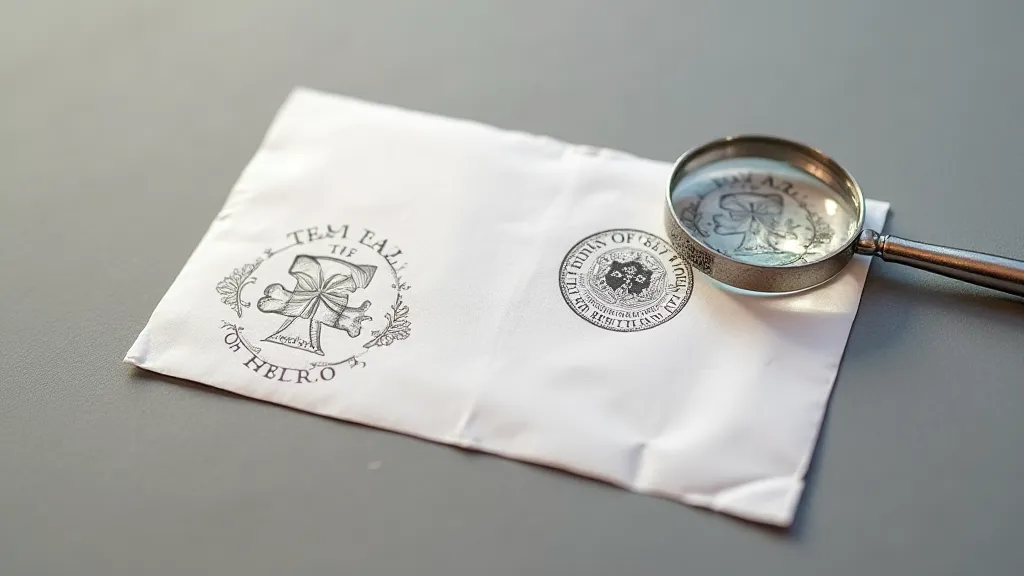
The 1963 Kitty Hawk Issue – Incorrect Cachet Color
The 1963 Kitty Hawk commemorative FDCs were printed with a cachet (the design printed on the envelope) in either blue or brown. A small number of covers were inadvertently printed with the blue cachet on brown envelopes, and vice-versa. These "wrong color" covers are highly desirable due to their extreme rarity. It’s a simple mistake, but the consequences for collectors were profound.
The 1970 Penny Black Issue – Misperforated Covers
The 1970 Penny Black commemorative stamp created considerable excitement. During the production of the FDCs, a number of envelopes were subjected to an unintended perforating process, creating tiny holes around the edges of the cachet. While seemingly insignificant, these "misperforated" covers are considered errors and command a premium amongst serious collectors.
Franking Irregularities – A World of Possibilities
Beyond printing errors, anomalies in the franking (postage) can also elevate an FDC’s value. An incorrectly applied postage stamp (either too high or too low), a missing postage stamp, or a stamp applied in an unusual way can all be considered errors. The key here is documentation – proving that the irregularity is indeed an error and not a deliberate design choice can be challenging.
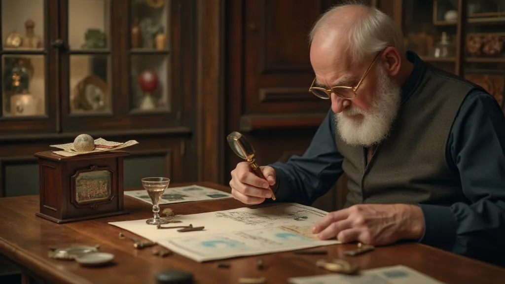
Preservation & Restoration: Handling the Anomalies with Care
Restoring an FDC, especially one with errors, is a delicate process. The goal isn’t to erase the error; it’s to stabilize the cover and prevent further deterioration. Aggressive cleaning or attempts to “correct” the error can significantly diminish its value. Professional philatelic conservators possess the expertise and tools necessary to handle these covers with the utmost care. The journey of a stamp, from its conception to its placement on an envelope, embodies a blend of artistry and precision – a process often shaped by unexpected deviations. The beauty often lies in those very deviations, telling a story richer than any textbook can describe.
Proper storage is equally important. Acid-free covers and archival sleeves protect the envelope from moisture, light, and handling damage. Remember, these covers are often irreplaceable; treating them with respect is paramount. The intricacies involved in the production and evolution of these collectible pieces are truly fascinating, creating a tapestry of history and artistry.
The Enduring Appeal of Imperfection
The world of First Day Covers is often associated with precision and order. But it’s in the imperfections – the errors, the anomalies – that a deeper appreciation for postal history emerges. These "flaws" aren't blemishes; they're windows into the past, reminding us of the human element involved in the seemingly mundane act of sending a letter. As my grandfather often said, they provide a unique lens into the past.
These moments of deviation often reveal the subtle influences of human involvement, underscoring the inherent narrative woven into each piece. They offer insight into the processes and decisions that shaped the past, allowing us to connect with history on a more personal level. Understanding the context surrounding these errors – the pressures faced by postal workers, the constraints of printing technology – enriches our appreciation for these rare artifacts. For a deeper exploration of the history and artistry behind these postal treasures, readers may find "The Alchemy of Postage: Transforming Common Paper into Treasured Moments" particularly enlightening.
My grandfather’s words still resonate with me: “They show you the hand that guided them.” And it’s that human connection, that sense of shared experience, that makes collecting these anomalous FDCs so rewarding. They’re not just pieces of paper; they’re stories waiting to be discovered, testaments to a time when even the most meticulously planned process could be touched by the unexpected beauty of imperfection.